From scattered data to useful dashboards: business analytics with Python, SQL and automation
How to turn scattered data into business dashboards: sources, cleaning, SQL, Python, KPIs, Power BI, automation and documentation.
A dashboard should not be a wall of charts. It should be a tool for making decisions.
Many companies have data spread across CRMs, spreadsheets, emails, internal tools, forms, manual exports and databases that do not always talk to each other. The problem is not only visualisation. The problem is turning scattered information into a reliable basis for decisions.
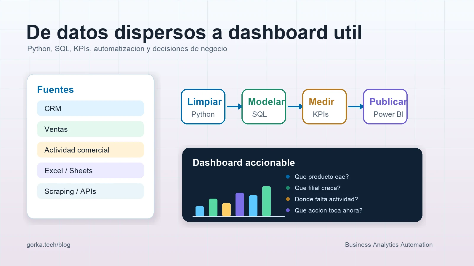
In automation and analytics projects, I try to see the dashboard as the last step of a chain: source, cleaning, model, metric, visualisation, documentation and action.
Direct answer
To turn scattered data into a useful dashboard, you need to inventory sources, define KPIs, clean and normalise data, create a shared model, automate refreshes, document rules and design visuals that answer concrete business questions.
| Layer | Question it must answer |
|---|---|
| Sources | Where does the data come from and who maintains it |
| Quality | Which fields are missing, duplicated or inconsistent |
| Model | How customers, sales, products and activity relate |
| KPIs | Which decision each metric supports |
| Dashboard | Which question each visualisation answers |
| Automation | How it refreshes without repetitive manual work |
| Documentation | What each data point means and where its limits are |
Visual design matters, but a beautiful dashboard with poorly defined data only makes the mistake more convincing.
1. Start with questions, not charts
Before opening Power BI, Looker Studio, Google Sheets or any visualisation tool, I would ask:
- which decisions the team wants to make;
- which information is checked manually today;
- which reports are repeated weekly or monthly;
- which data creates doubts;
- which metrics are debated because people calculate them differently;
- which action should come from each dashboard.
A good commercial dashboard can answer questions such as:
| Question | Possible metric |
|---|---|
| Which products are growing or falling | Sales by product and variation |
| Which affiliate needs support | Evolution by country, team or region |
| Where is commercial activity missing | Visits, calls, meetings or follow-up |
| Which customers are losing traction | Frequency, recency or purchase drop |
| Which actions should be prioritised | Segmentation by opportunity or risk |
If a chart does not help anyone decide anything, it probably does not belong there.
2. Inventory sources and data owners
A common mistake is extracting data without knowing who understands it. In business analytics, every source should have a functional owner and a technical owner.
| Source | Example | Risk |
|---|---|---|
| CRM | Customers, contacts, opportunities | Incomplete fields or different criteria |
| Sales | Product, date, amount, affiliate | Format or currency changes |
| Commercial activity | Visits, meetings, calls | Irregular recording |
| Excel or Sheets | Local reports | Manual versions and duplicates |
| APIs or scraping | External data | Structure or availability changes |
It is not enough to know that the data exists. You need to know how it is generated, who modifies it, how fresh it is and what each field actually means.
This connects directly with AI process architecture and BPM: before automating or visualising, you need to understand the process that produces the data.
3. Clean data before measuring
Cleaning is not a secondary phase. It is where many metrics gain or lose credibility.
Frequent problems include:
- customer names written in multiple ways;
- dates with different formats;
- products with old and new codes;
- countries or affiliates written with inconsistent abbreviations;
- duplicated rows;
- empty or negative amounts without explanation;
- commercial activity recorded with different criteria;
- required fields that are not always completed.
With Python and Pandas, a reproducible cleaning layer can be created:
import pandas as pd

sales = pd.read_csv("sales_export.csv")

sales["date"] = pd.to_datetime(sales["date"], errors="coerce")
sales["country"] = sales["country"].str.strip().str.upper()
sales["product_code"] = sales["product_code"].astype(str).str.strip()
sales = sales.drop_duplicates(subset=["order_id", "product_code"])
sales = sales[sales["amount"].notna()]
The idea is not to make everything complex. The idea is to make rules explicit and repeatable. If a person cleans an Excel file manually every Monday, the process depends too much on memory and individual judgement.
4. Create a shared model with SQL
SQL helps turn loose data into a structure the business can query.
A simple model could separate:
- customer table;
- product table;
- sales table;
- commercial activity table;
- team or affiliate table;
- calendar table.
Then metrics are built on top of that model:
SELECT
  country,
  product_family,
  DATE_TRUNC('month', sale_date) AS month,
  SUM(amount) AS revenue,
  COUNT(DISTINCT customer_id) AS active_customers
FROM sales_clean
GROUP BY country, product_family, DATE_TRUNC('month', sale_date);
When queries are well defined, the dashboard no longer depends on scattered formulas. The logic lives in a more controlled, versionable and reviewable place.
5. Define KPIs precisely
A poorly defined KPI creates long meetings. A well-defined KPI reduces debate.
Each metric should have:
| Field | Example |
|---|---|
| Name | Active customers |
| Definition | Customers with at least one purchase in the last 90 days |
| Source | sales_clean table |
| Frequency | Daily refresh |
| Owner | Commercial team / data owner |
| Limits | Excludes customers without a validated order_id |
This documentation seems small, but it prevents the classic "my number does not match yours". If two teams calculate sales, activity or conversion differently, the dashboard does not align decisions. It fragments them.
6. Automate refreshes
The value of a dashboard decreases quickly if it depends on copying and pasting files every week.
A lightweight architecture could be:
Sources
  -> scheduled extraction
  -> Python cleaning
  -> load into database or structured sheet
  -> SQL queries or semantic model
  -> dashboard
  -> alert if data is missing or refresh fails
In a first version, n8n can orchestrate downloads, webhooks, notifications, scheduled executions and movement between tools. Python can handle transformations and validations. SQL can provide the query layer. Power BI or a similar tool can publish the business view.
There are also cases where orchestration and backend should be separated. I explain that in n8n, FastAPI and Spring for AI automation.
7. Design dashboards for action
A good screen does not try to show everything. It prioritises.
For a commercial dashboard, I like this order:
- general status;
- important variations;
- segment detail;
- alerts or exceptions;
- recommended actions or next steps.
Example:
| Block | Question |
|---|---|
| Executive summary | How is the region doing this month |
| Sales by product | What is rising and what is falling |
| Commercial activity | Where is follow-up lower |
| Segmentation | Which customers need priority |
| Data quality | Which sources are incomplete |
The dashboard should not hide data quality problems. If data is missing, it should be visible. A business user trusts a tool more when it acknowledges its limits than when it pretends to be perfectly precise.
8. Use AI as support, not as the source of truth
AI can be very useful in analytics:
- explaining variations;
- generating executive summaries;
- classifying commercial comments;
- detecting simple anomalies;
- suggesting questions to investigate;
- converting natural language into controlled queries;
- documenting insights for stakeholders.
But it should not be the source of truth. Metrics should come from data, rules and controlled queries. The model can help interpret, not invent numbers.
This approach also applies to systems with search and evidence, as I explain in OSINT with LLMs, web search and verifiable evidence.
Final checklist
Before accepting a dashboard, I would review:
- Sources are identified.
- Each KPI has a definition and owner.
- Data cleaning is reproducible.
- Duplicates and empty fields are controlled.
- Main queries are versioned.
- The dashboard answers concrete questions.
- Refreshes do not depend on manual copy-paste.
- Alerts exist when loading fails.
- Data limitations are visible.
- Documentation exists to maintain the system.
Conclusion
A good dashboard starts long before the chart. It starts when someone asks what decision needs to be made, which data supports it and which process keeps that data alive.
Python, SQL, Power BI, n8n or AI are tools. The important part is turning scattered data into reliable, repeatable and actionable information.
For me, that is where analytics stops being decorative reporting and starts becoming a real business tool.